


✢ 2023 ✢
Yearbook Design
Portfolio
by
Natalie Scarlett
I'm a yearbook editor-in-chief from Huron High School. I have about 2 years of experience working with design and yearbook. I'm a senior this year, and during my time working on the yearbook I've gained multiple skills, such as communication and leadership!
About me
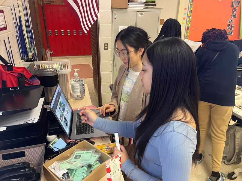
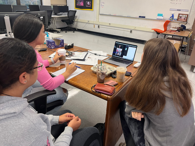
Editing, Teambuilding, & Leadership
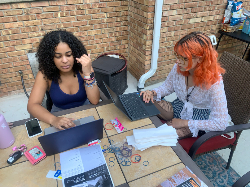


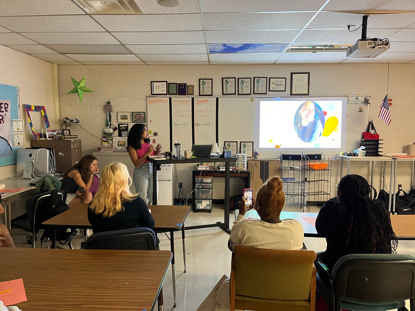
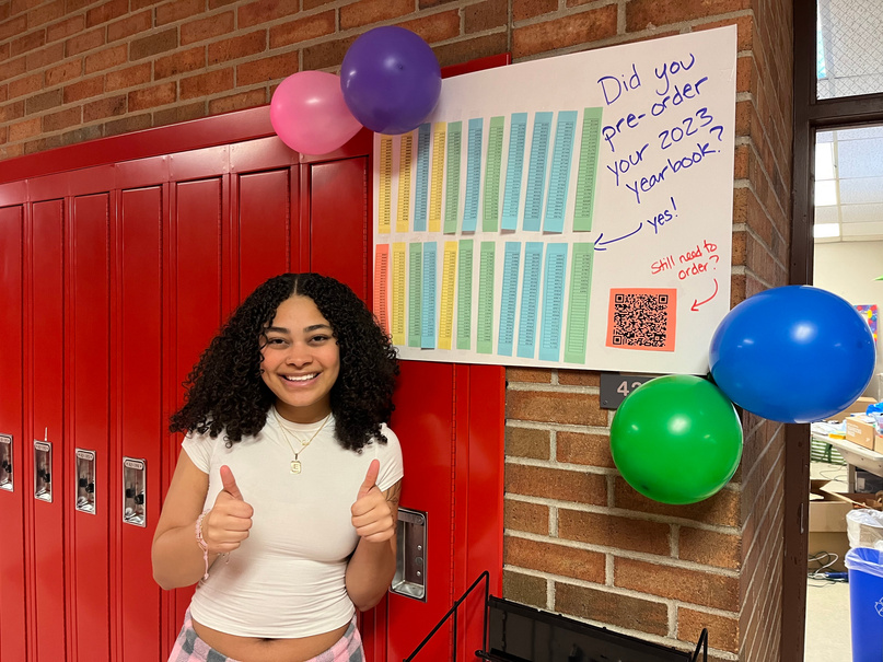
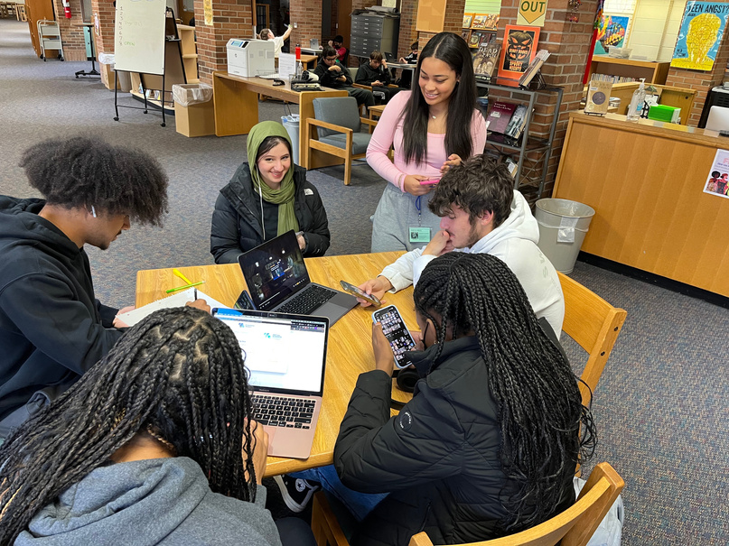
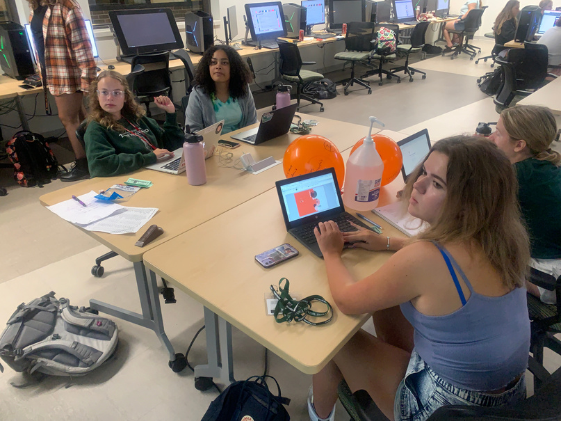
I spent last summer at MIPA camp curating and designing themes and layouts for this year's yearbook, It's something I'm very passionate about. I enjoy writing about sports and designing, specifically designing with various color aspects that we can incorporate into the book. I enjoy working alongside my staff to create memorable work! Because of yearbook I've gained so many lifelong friends and met wonderful advisors and teachers who have impacted me and my future immensely.


Design
For each of the following pages I took time to overview the content, then chose corresponding colors to get the best outcome. It was extremely important to me that each page and its layout was guided by the photos, in order to have the story told be told to the fullest extent. Throughout my time working within the yearbook and learning how to design, I have gone to multiple workshops, listened in on countless journalistic lectures, and experienced countless opportunities to become a better designer. These experiences include the MIPA camp, where I took a theme workshop, and designed things such as the opening and title page within just a few days.
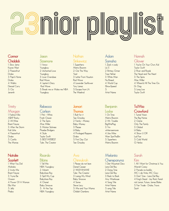
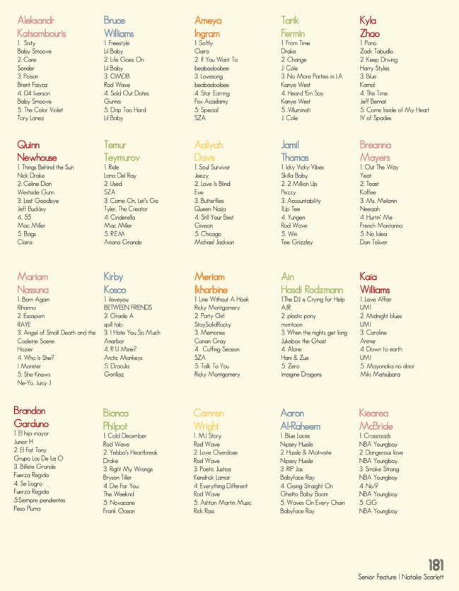
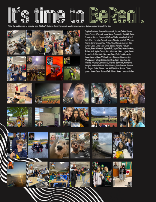
This page was extremely fun to work on. I used all of our colors to make the page bright and colorful, that way each individual student could easily point out their name.
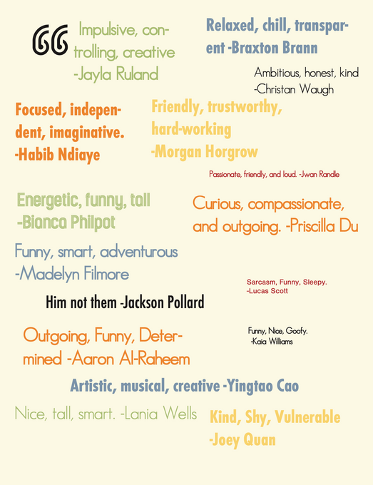
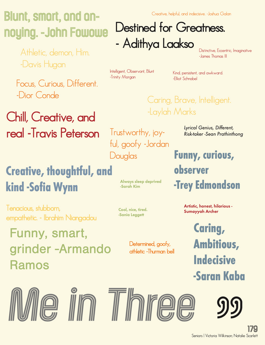
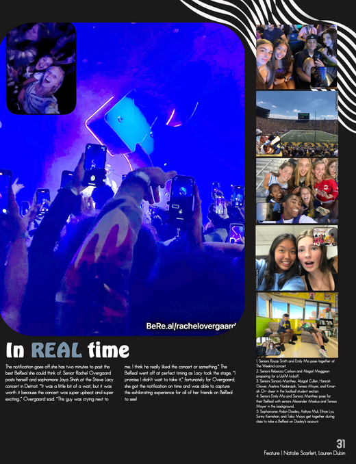
This spread itself was pretty challenging compared to the others I had worked on, from flipping the colors to create a black-and-white effect to gathering each student's name and placing it in the right spot; it was a lot of work. I'm very proud of my work here and I looked back on this page to critique my other pages.
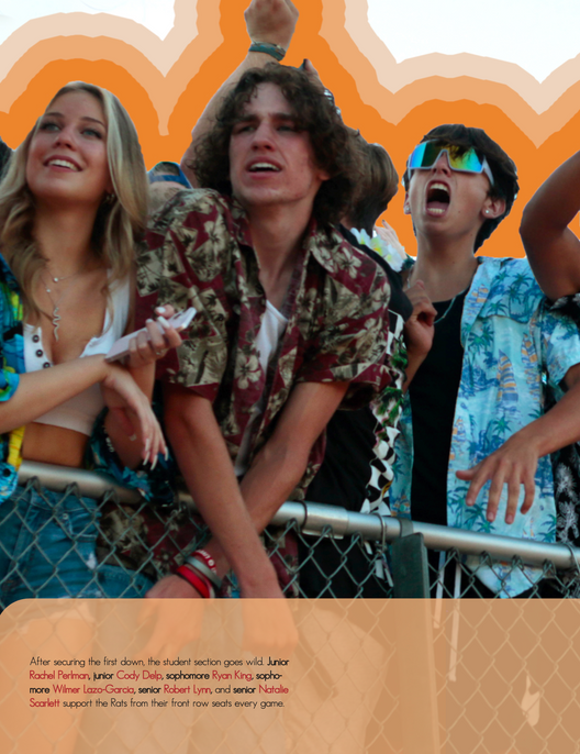
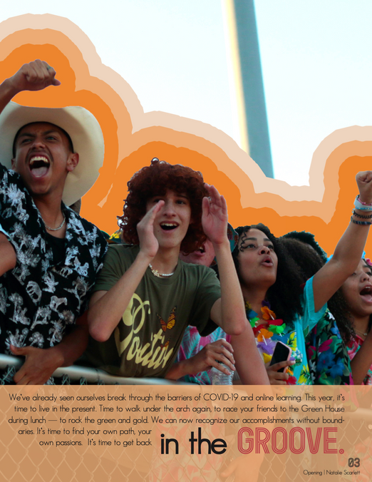
Our opening copy is by far my favorite page. The orange brings out each color of the student's clothing, and our graphic element enhances everything else going on. We went through so much trial and error within this page, and since it was the first 2-page spread I needed it to be eye-catching, and something worth remembering. I got to see my vision of the entire book come to life on this spread.
While I was not the main editor on this page, I did make an executive decision last minute. This page was previously blue-themed, having all the graphic elements and bold text being blue instead of the green that's here now. I like when content drives the page, and since the main photo was already filled with greenery, I felt that it fit much better. After talking with the editor in charge of the page we agreed and changed it. I'm really proud of how it turned out.
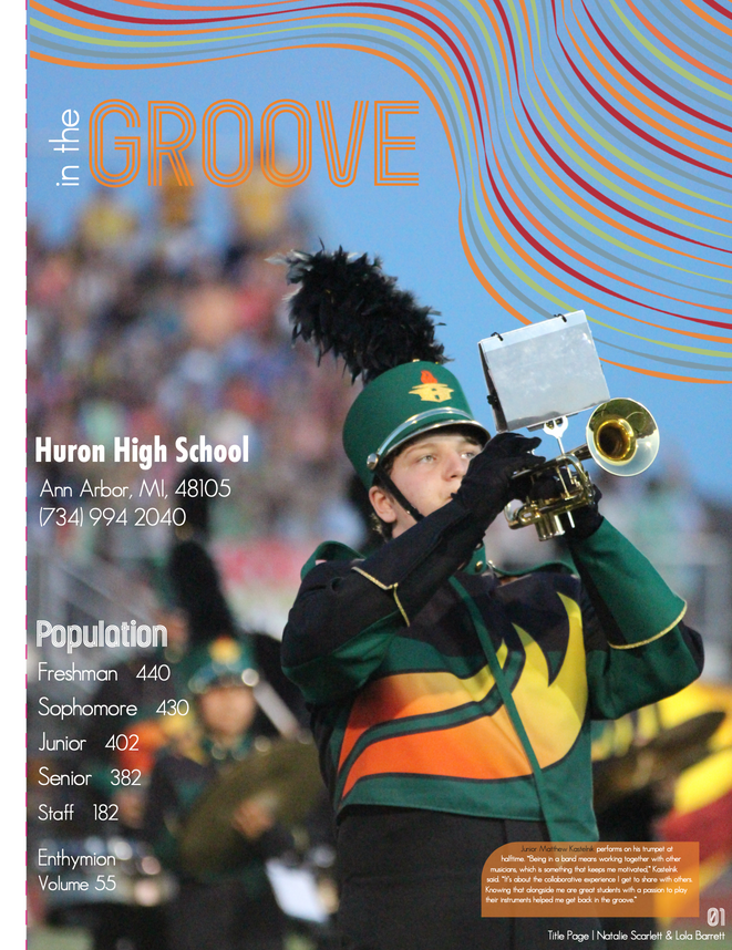
This title page was a struggle for many reasons. It was the first page we were trying to incorporate all of our fonts on, and it started out having each color on it as well. After trial and error, I knew we landed on the right look after adding our graphic design. I'm in love with the main feature photo as I feel the band does not get as much recognition as some of our other extracurriculars do, so having this student stand out means everything to me, and hopefully everything to him!
Again this was not a page I worked alone on, But with all of the content I rearranged and edited the layout of this spread more than once. At first, the focus was on the left-hand side, but everything felt boxy. I like utilizing the negative space on pages. I moved mods around and landed on this layout that I'm very happy ith. I also think our graphic element highlights the singular mod very well
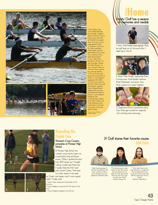
Pages 42-43 is by far my favorite page in the book. This page is the sole reason I decided that our book needed to include yellow; not only because It was one of our school colors, but because the sun reflecting off the water in the main photo was so incapsulating I wanted the rest of the page to follow the same vision. Pag 42-43 was the introduction of SH Peach Puff and I'm so grateful I decided to add it, even if it as a little late into the deadlines.
Picked specifically to fit our "In the Groove" theme, the fonts, and colors represent a 70's feel while also including our school colors. The curved lines and rounded edges give the book itself a "carefree" essence and allow readers to have the graphic elements carry them from page to page. The colors used in the book are EW Lettuce, VT Mango, VA Crimson Pride, SH Peach Puff, and CS Mystic Blue. The main background color of pages was OR Eggshell.


